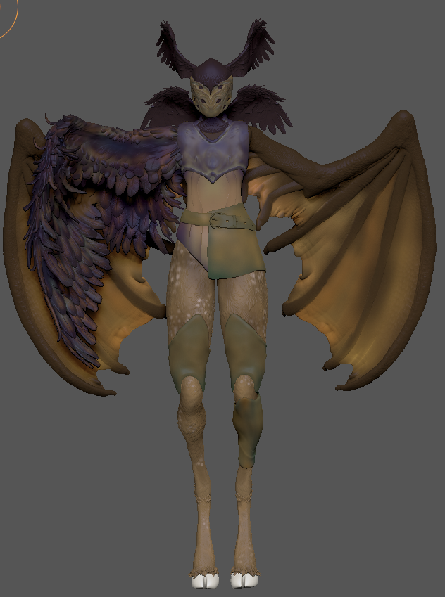
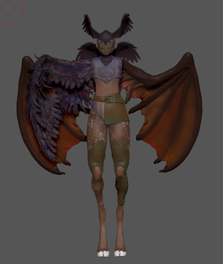
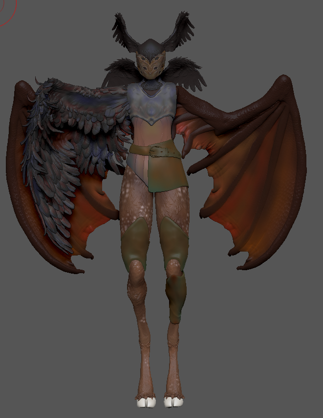
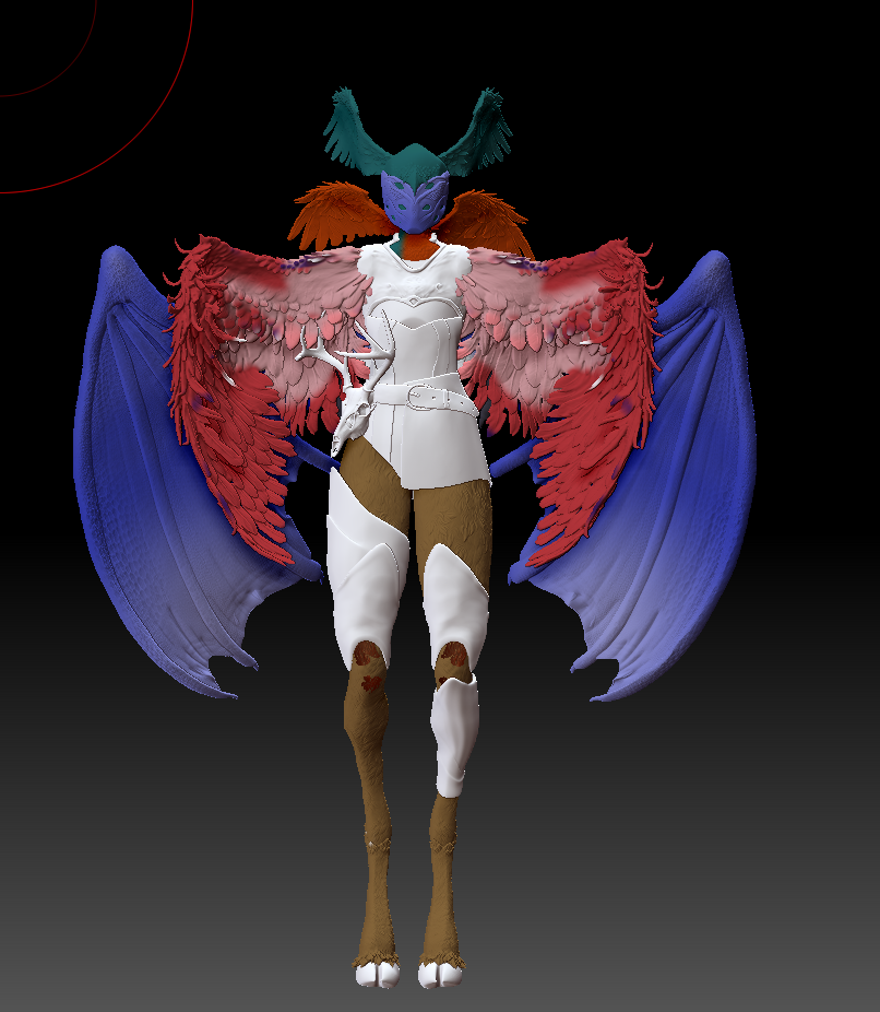
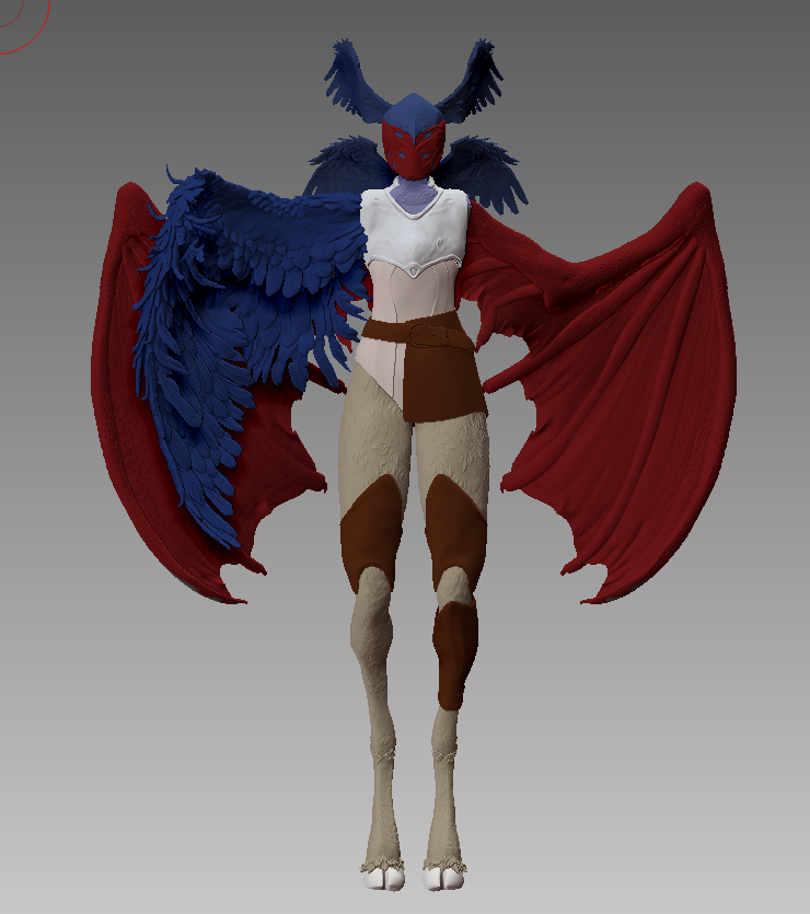
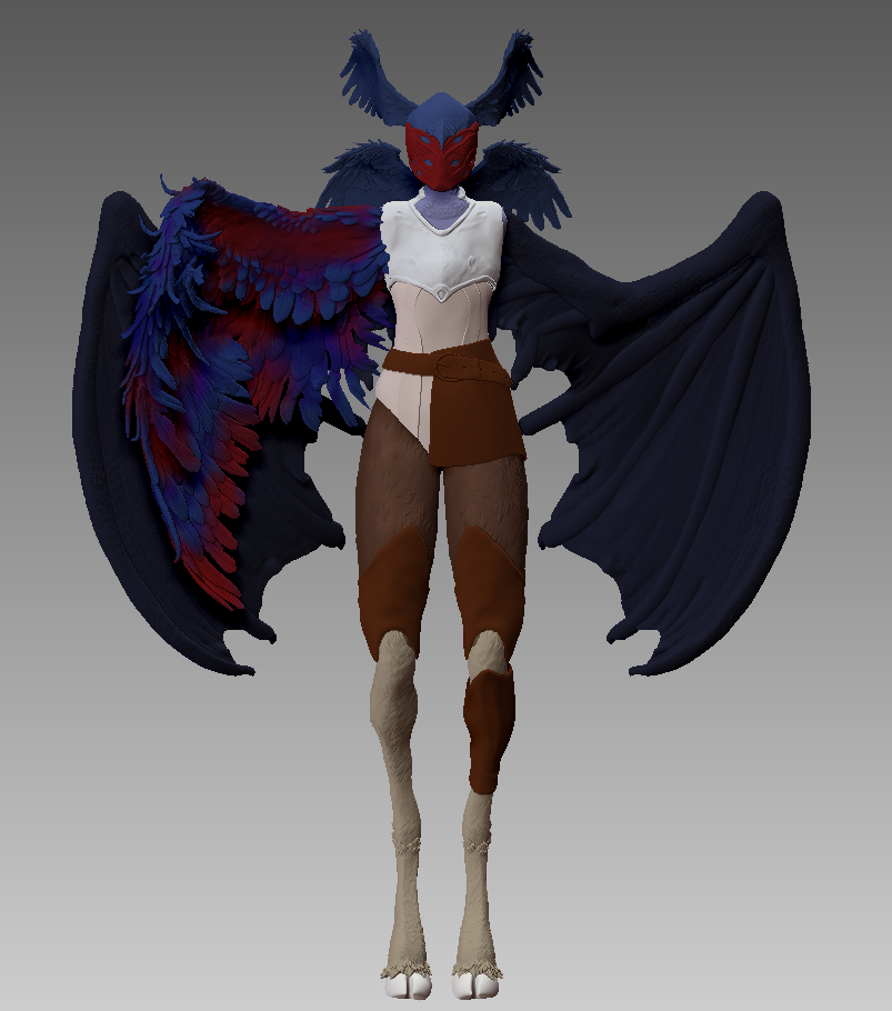
I experimented with a couple different colour schemes, playing around with a combination of warmer and cooler tones. Considering the nature of my creature, I wanted to find a balance between cohesivity and contrast.
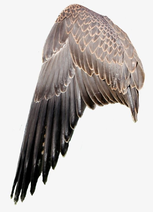
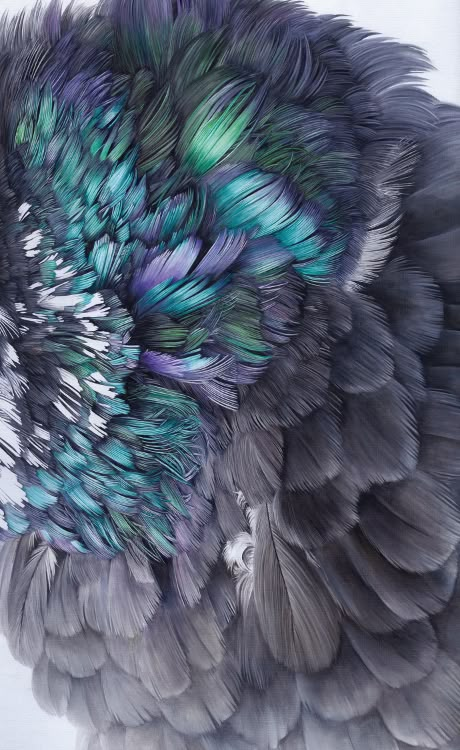
When it came to the details for the colouring on z-brush I made sure to use references for the different animals my creature was made up of. As the animals had a range of colour stories and textures, I looked for variety so I could pick elements from each to make a cohesive model.
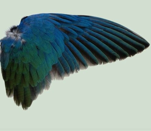
I started adding different tones with a light brush, layering colours to create the effects I wanted. For the main bird wings on the body, I followed the contours of the wings and the layers of feathers with darker colours, to create depth. I used contrasting colours for the highlights and tried to have a smooth transition between the shadow and highlights to create an ‘oil spill’ effect.
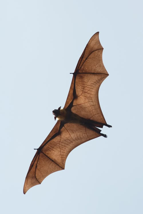
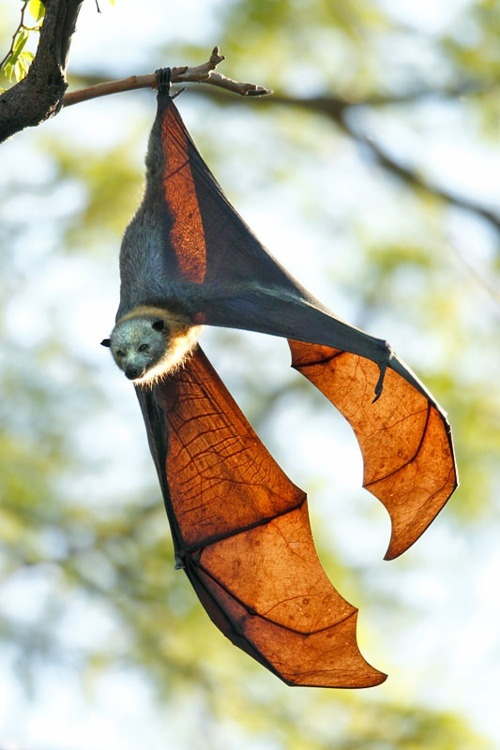
For the batwings, I tried to convey the transparency of batwings by having lighter colours towards the middle of the membrane, and darker towards the bones of the wings.
For the armour and clothing, I used a similar process to the bird wings, using contrasting colours blended together to have something visually interesting. I looked at how copper oxidises and tried to implement that shame logic in demonstrating the wear on my creatures armour and clothing
I really liked this part of the process, as I found it brough my model to life and helped make everything more developed.
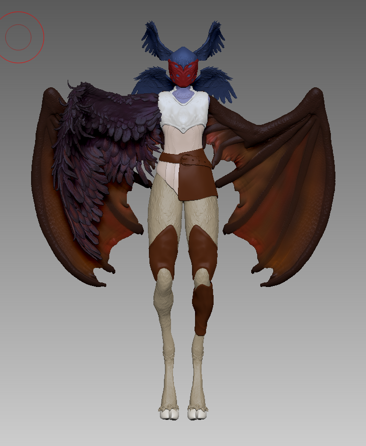
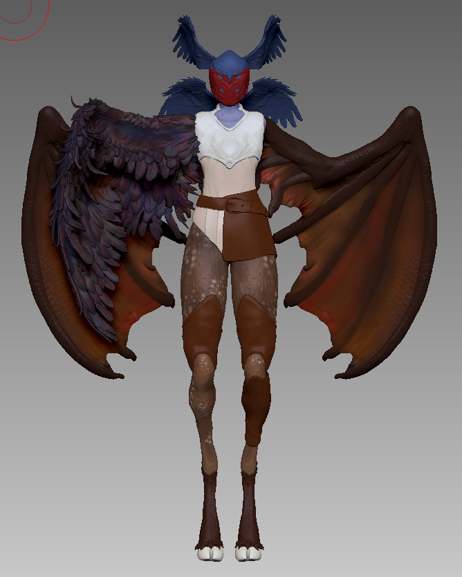
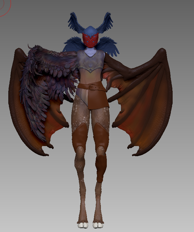
After colouring my model, I took a screenshot into Photoshop and played around with different levels and adjusting the colours. I wanted to use these as reference for when I began to render my model.